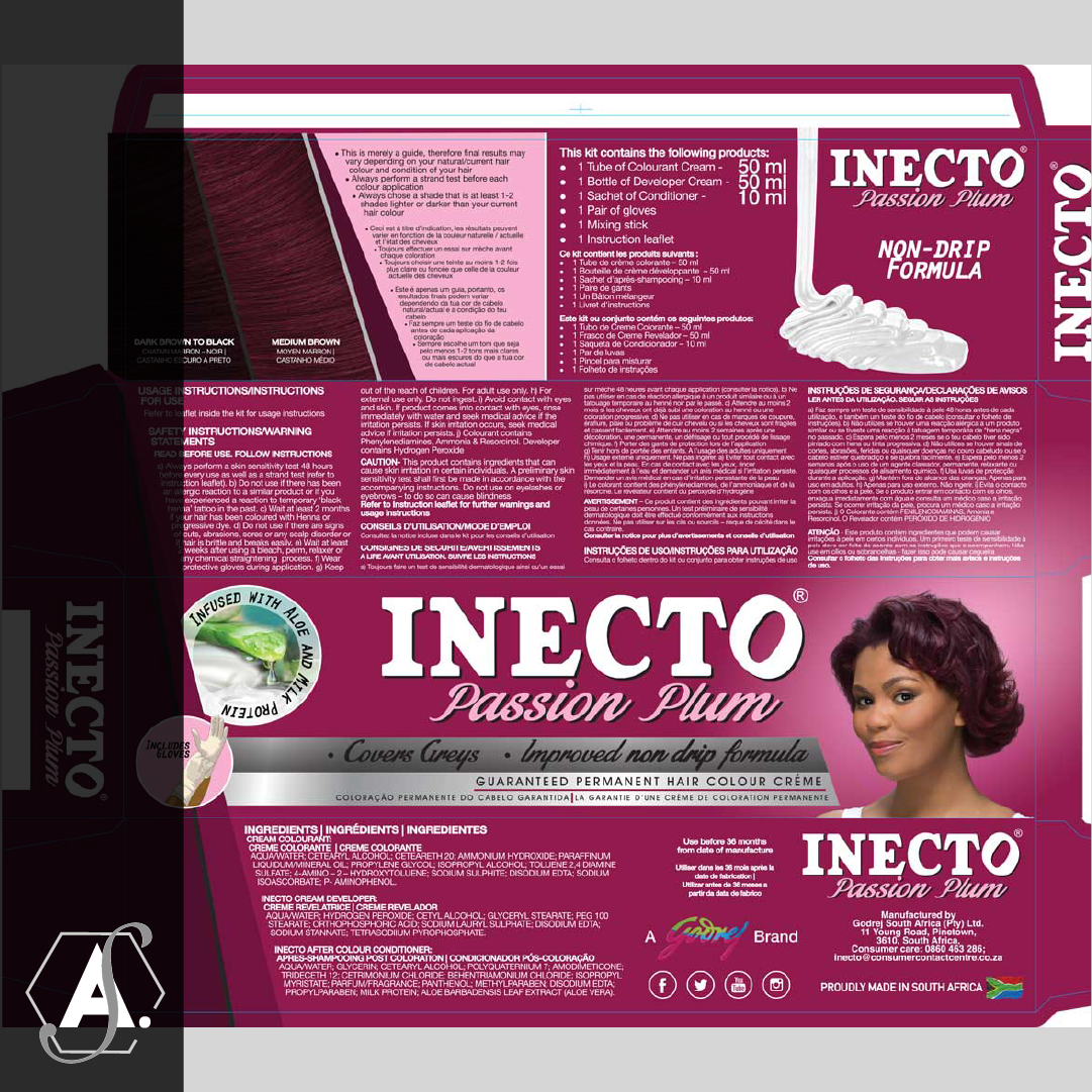
Inecto Colours is one of Inecto’s biggest brands next to Inecto SuperBlack. Similar to SuperBlack it has a strong heritage and loyal consumers. The decision was taken that it was time to refresh the Inecto Colours packaging to make it more relevant for today’s consumer and to use more realistic and true to the brand target market models.
I was involved in this project from concept to launch, including research, model scouting, photoshoots, support material, and ofcourse packaging and it is one of the projects I am most proud of.
Because of the nature of the brand, it was imperative to make sure that the refresh would be well received and so the first step was to decide on how far to push the design boundaries of new packaging compared to what consumers were used to. I designed several concepts and these were narrowed down into three passable packs which ranged from minimal changes to drastic changes. We then did consumer research which I sat in on and was able to observe first-hand consumer reactions to the various packs and to understand their views and insights.
Once it was determined how much we could change the packaging (not very much) we began the process of finding models. I sat in on and helped decide on each model for the future Inecto Colours packs. Our goal was to find real South African women to ensure a fair representation of our consumer. Once the models were chosen the photoshoots were scheduled. I sat in on the photo shoot as well and had creative input on models poses and appearance. We knew that the models needed to face a certain direction and so this was maintained throughout.
I then began the process of rolling out the finalised design across all 18 SKUs including two new shades which would be launched simultaneously, as well as touch up and colour correction from scratch of all models. I worked with the Product development & integrity manager for colour correction to ensure that the model’s hair colours fairly represented what the colour of the dye would be.
Once all swatches and models were done and dropped into the artwork it was finally time to send this off to print. Usually printing entails sign off of sherpas where the product development & integrity manager would double-check and sign off on printed colour and any changes required would be made by me. I would sign off on design elements and the marketing department would sign off on the overall design.
Finally, the packs were complete, launches were had and support material was designed and delivered. These packs are still in the market today and it is a humbling yet wonderful feeling to see my packs out on shelves, even to this day each time I go shopping.

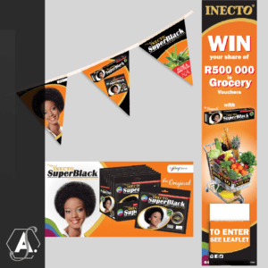
General point of sale work done throughout the last few years

Inecto Colours is one of Inecto’s biggest brands next to Inecto SuperBlack. Similar to SuperBlack it has a strong heritage and loyal consumers. The decision was taken that it was time to refresh the Inecto Colours packaging to make it more relevant for today’s consumer and to use more realistic and true to the brand target market models.


Work done over the course of the last few years for varies brands and organisations
