
Packaging Refresh & Brand Evolution
Category: FMCG | Haircare
Scope: Brand Refresh, Packaging System, Model Direction, Rollout Across SKUs
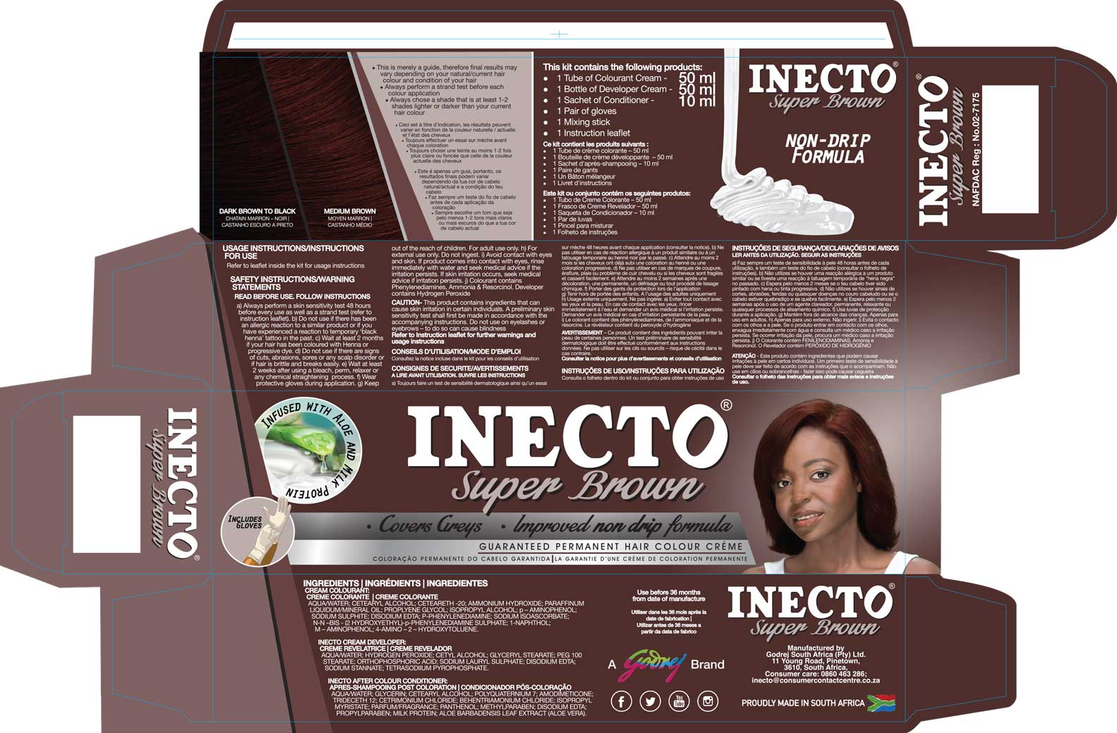
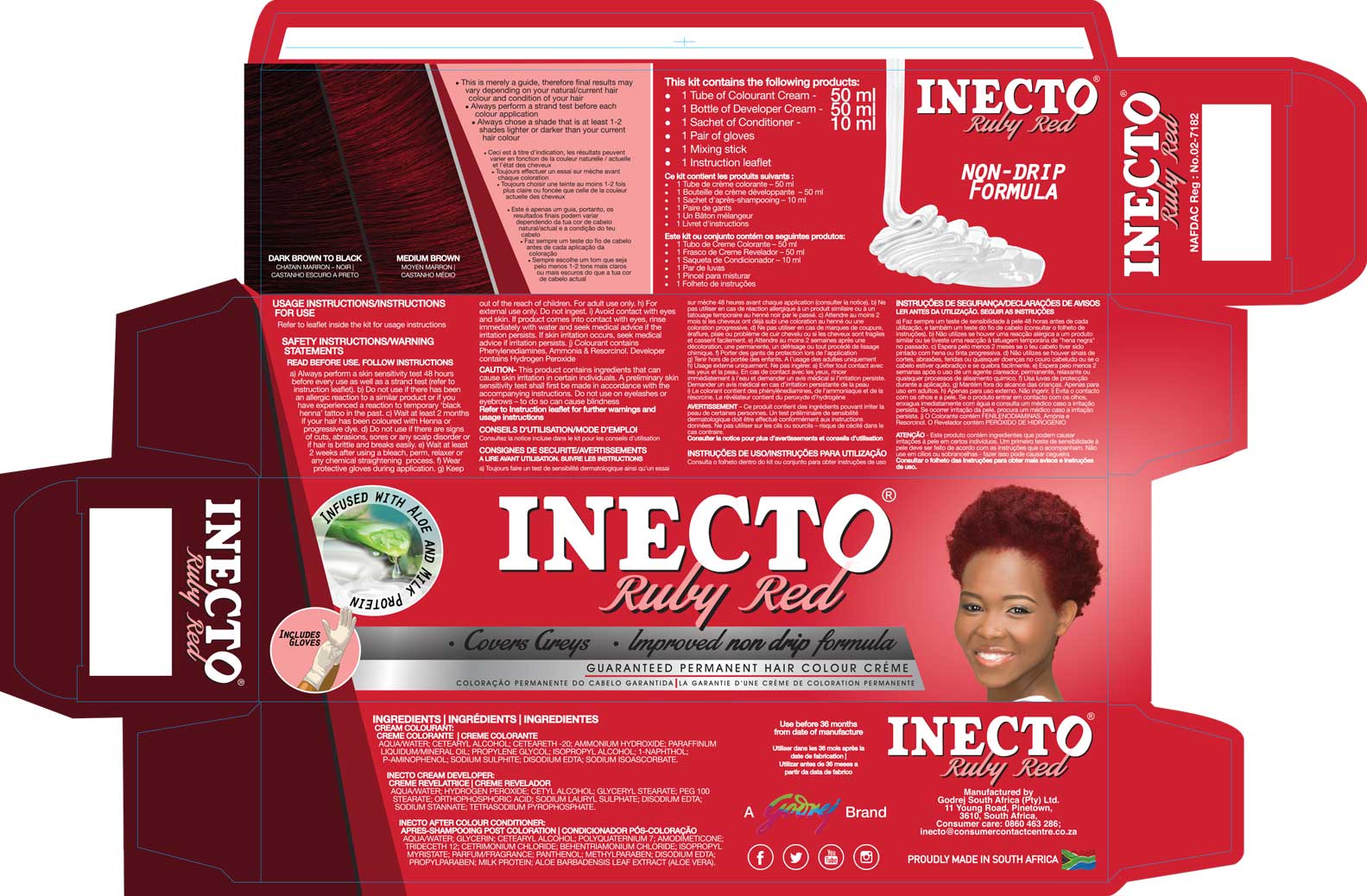
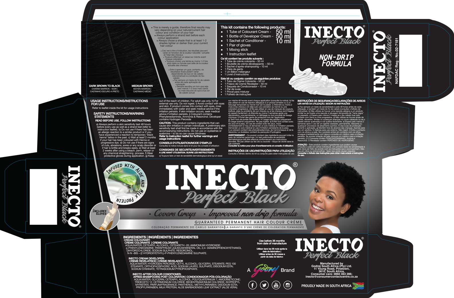
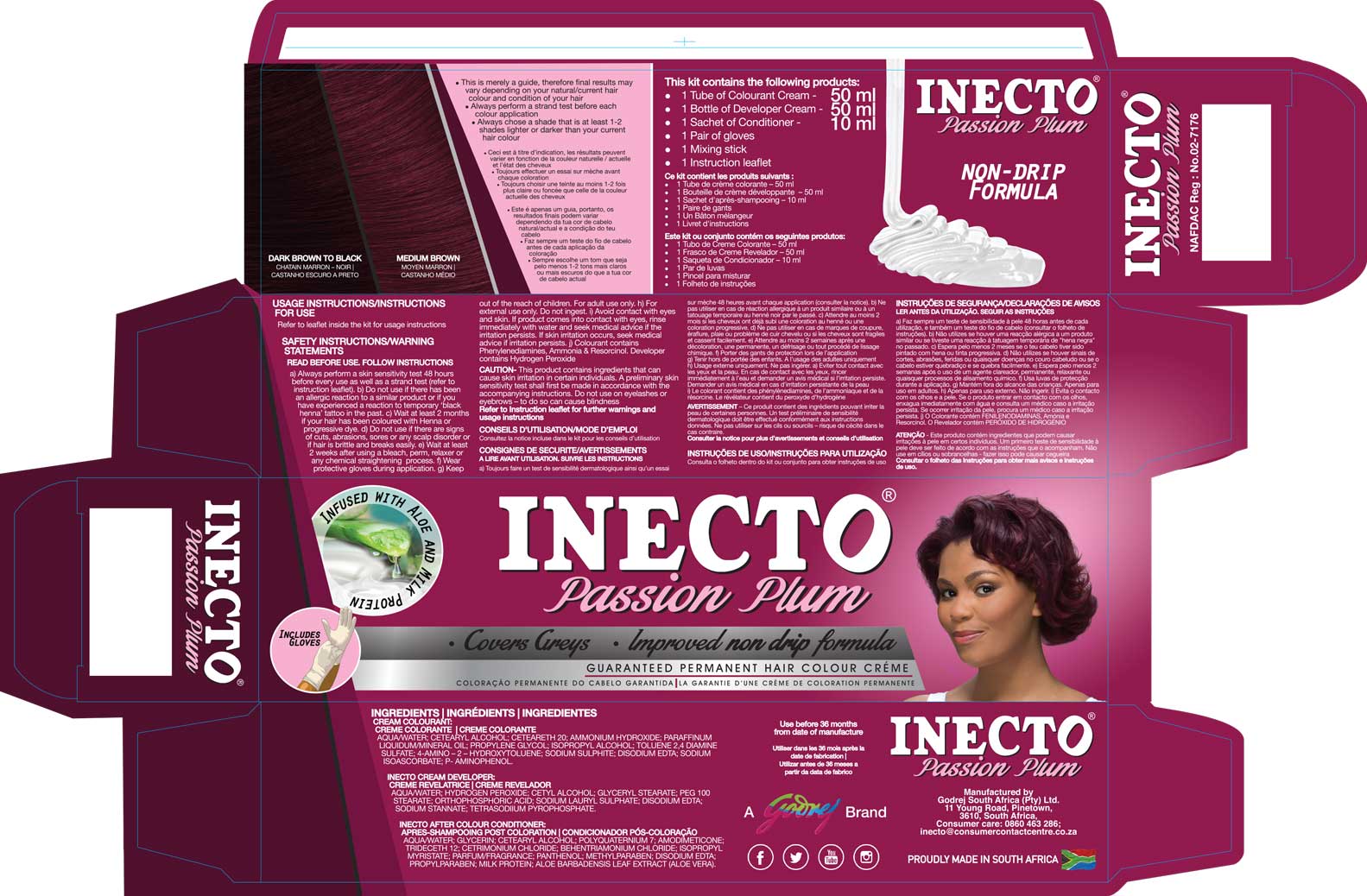
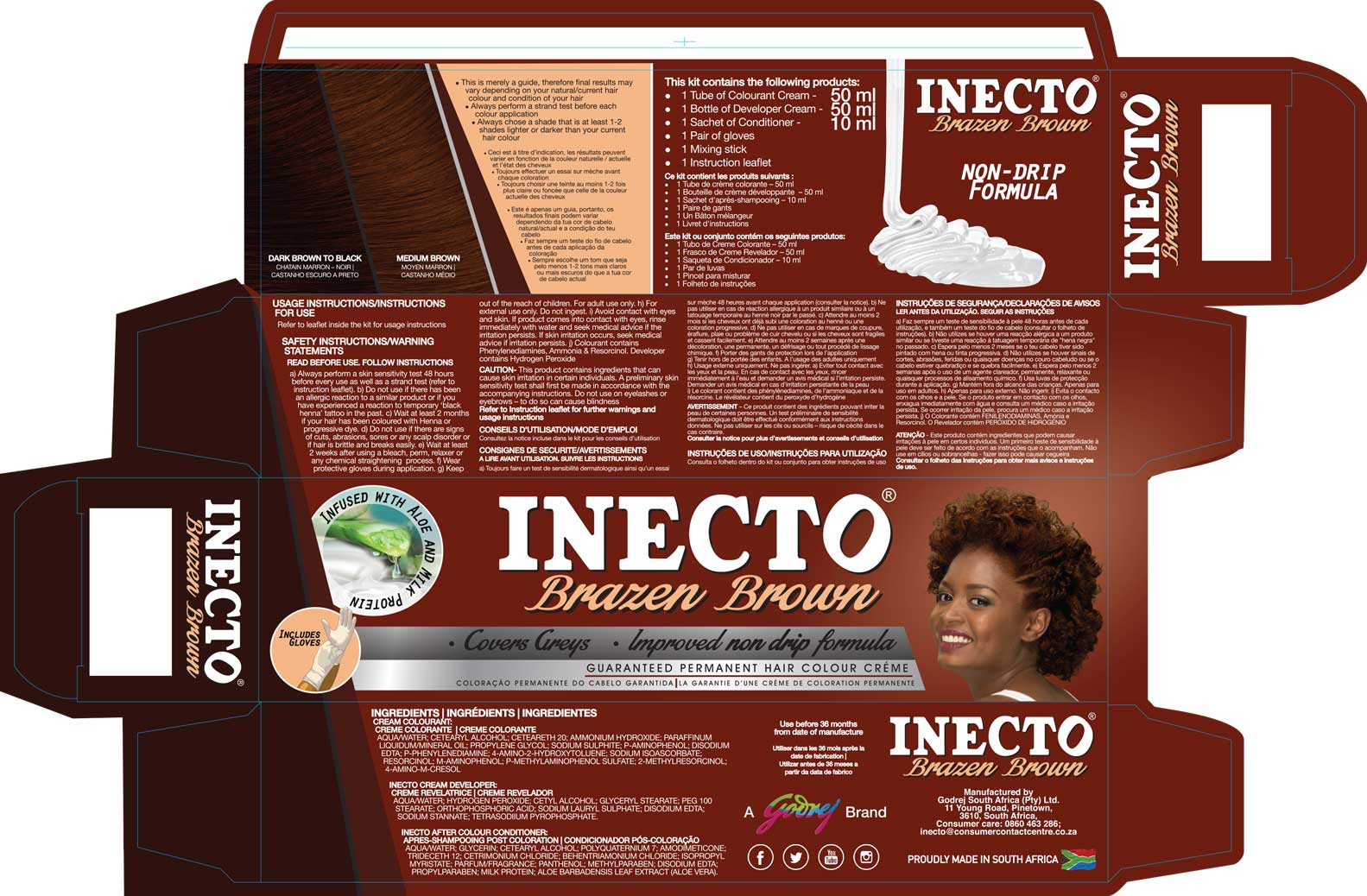
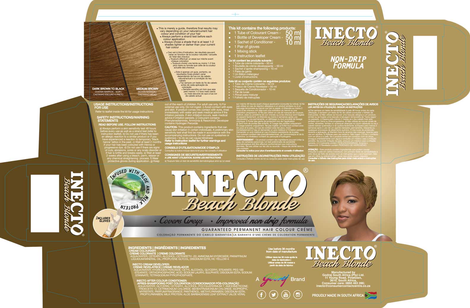
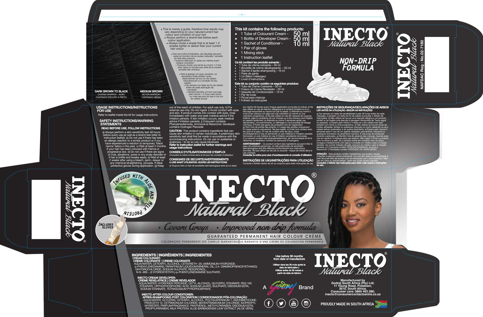
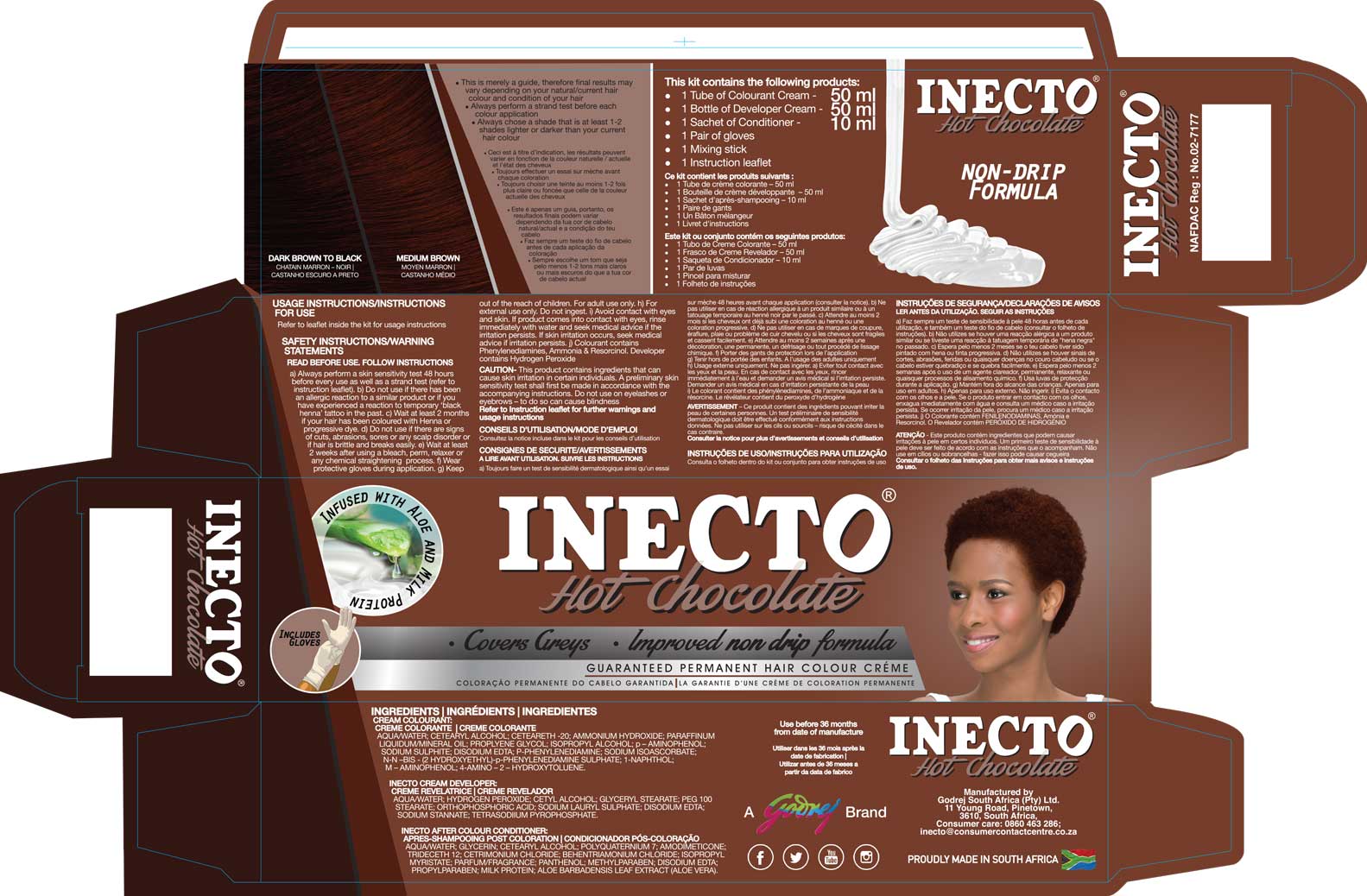
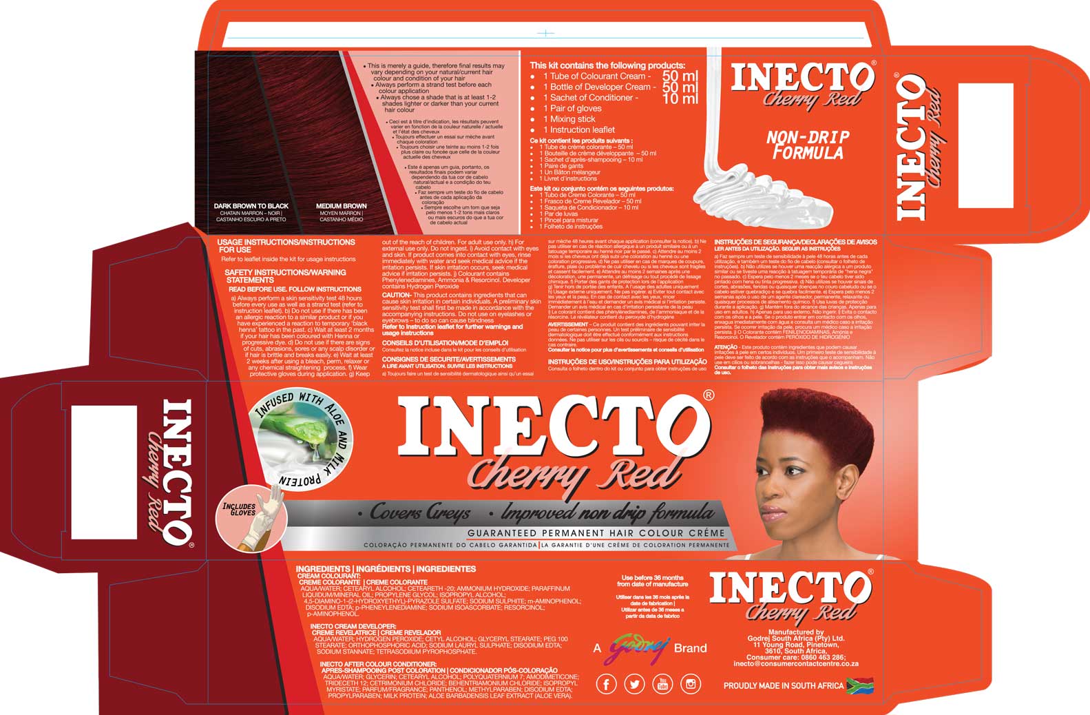
Inecto Colours is a nationally recognised hair colour range with strong heritage and a loyal consumer base in the South African FMCG market. As a trusted category leader, the brand required a considered evolution — one that honoured its legacy while remaining relevant to a modern, fashion-forward consumer.
Inecto Colours is one of the brand’s flagship ranges, with strong heritage and deep consumer loyalty within the South African market.
As consumer expectations evolved, the packaging required a refresh — not a reinvention — to remain relevant while protecting brand equity.
This project required a delicate balance: modernise the range without alienating a loyal customer base.
(*Delivered in a senior internal brand and design capacity)
The core challenge was strategic restraint.
How far could the design be pushed without compromising recognition?
How could model representation better reflect the real South African consumer?
How could a refreshed system scale consistently across 18 SKUs?
How could new shades be introduced seamlessly into an established range?
This was not just a packaging exercise — it was brand risk management.
A carefully calibrated evolution — informed by consumer research, brand heritage, and shelf impact — ensuring the refresh modernised the range without compromising recognition or loyalty.
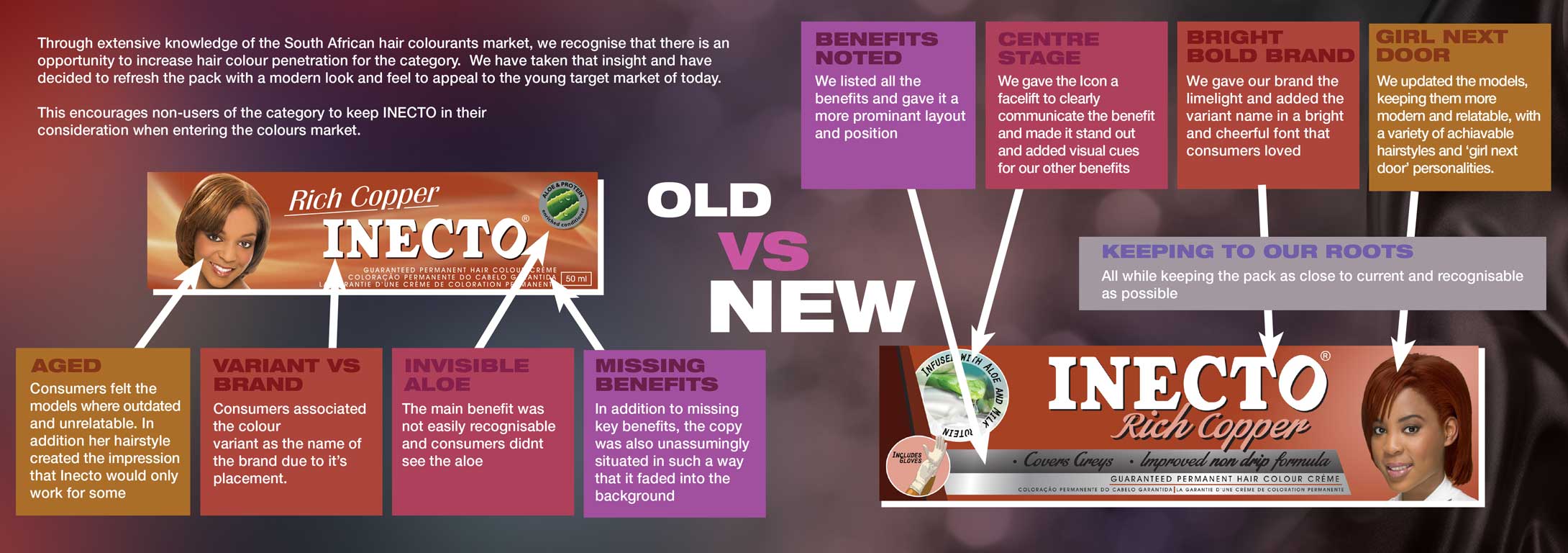
Multiple packaging routes were developed, ranging from conservative refinements to bold departures.
Three refined directions were taken into structured consumer research sessions to evaluate:
Shelf recognition
Brand trust perception
Modern appeal
Purchase intent
Consumer insights determined how much change the market would accept.
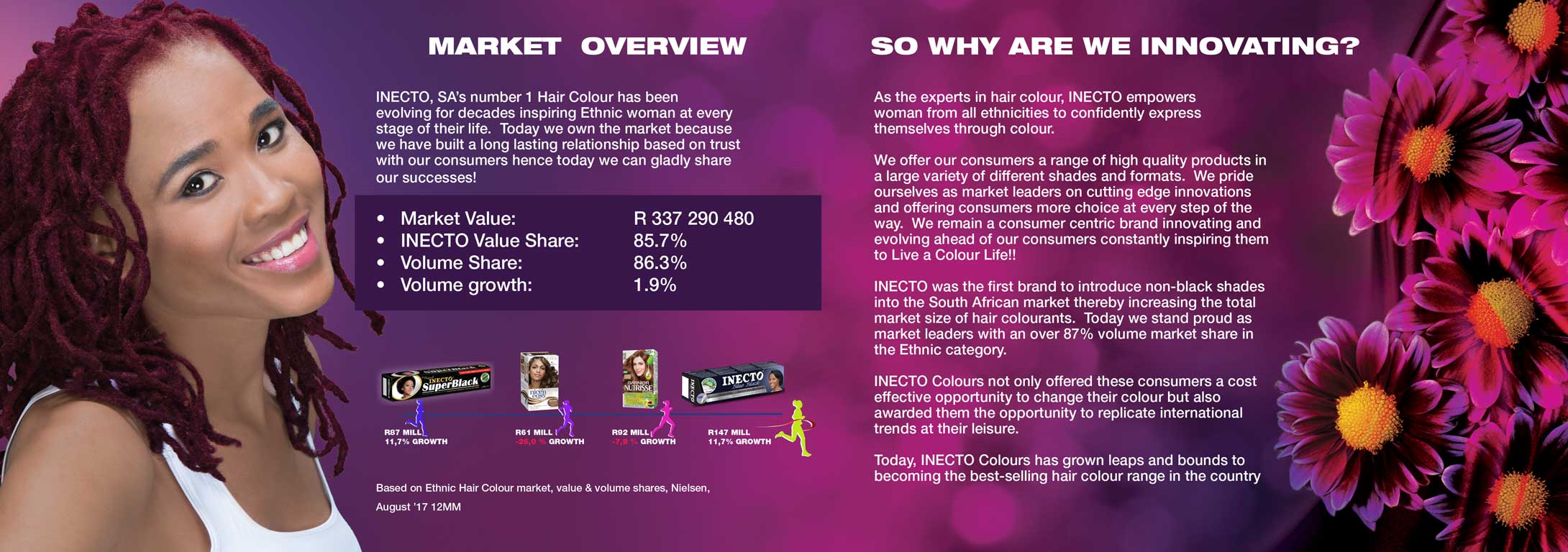
Model selection was critical.
The objective was to feature real South African women representative of the brand’s core consumer — not generic stock imagery.
Involvement included:
Model scouting input
Photoshoot direction
Pose and orientation consistency for system integrity
Hair colour accuracy guidance in collaboration with product development
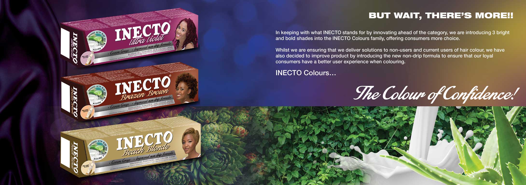
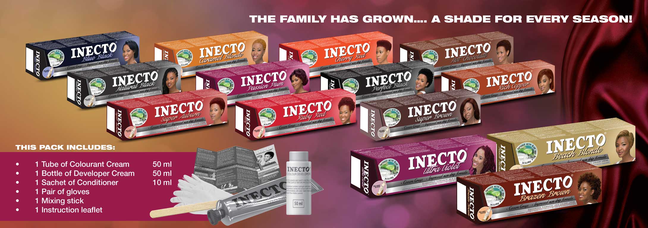
The final design was scaled across:
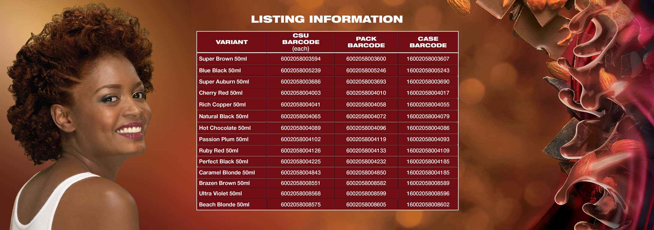
18 SKUs
2 newly introduced shades
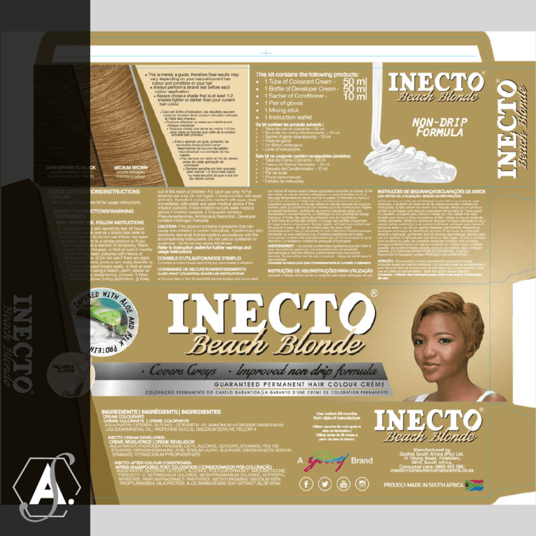
Packaging master artwork
Trade presentation material
Point-of-sale campaign collateral
Each shade required precise colour correction to ensure authenticity between packaging and actual dye result — executed in close collaboration with product integrity teams and print sign-off processes.
Full packaging artwork development
Colour correction & shade calibration
Print-ready file preparation
Printer proof (Sherpa) review and refinement
Cross-departmental sign-off coordination
Campaign support materials (trade presenters, POS, promotional collateral)
The result was a refreshed system that maintained heritage while introducing modern clarity and confidence.
Successful national rollout across the range
Introduction of new shades without diluting brand equity
Improved on-shelf relevance
Packaging still in market years later
Reinforced category leadership positioning
The refresh respected brand legacy while ensuring continued market competitiveness.
Brand Strategy | Packaging System | Design| Consumer | Insight Application | Visual Identity | Evolution | Model & Art Direction| Print Production Oversight | Campaign Support Collateral