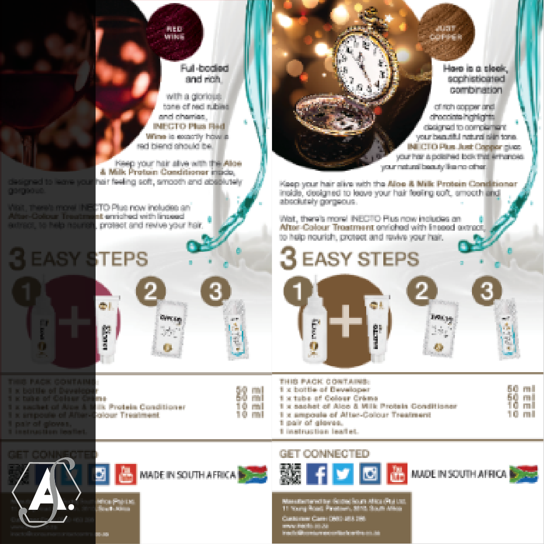
At the time that I joined the Godrej SA Family the Inecto Plus brand was in the process of undergoing a rebrand in order to create a fresh new look and to be more appealing to the target market. This was handled by an external agency but once the artwork was completed by them the marketing department and business heads felt that the back and sides of the pack were underutilized.
At the time that I joined the Godrej SA Family the Inecto Plus brand was in the process of undergoing a rebrand in order to create a fresh new look and to be more appealing to the target market. This was handled by an external agency but once the artwork was completed by them the marketing department and business heads felt that the back and sides of the pack were underutilized.
I was briefed to conceptualise and update the back and sides of the pack. I changed the hair colour swatches to make them bigger and to stand out more, and I also updated each back of pack to match the colour palette of the pack, and to tell a visual story of the consumer who might use that colour. Lastly, I did some updates to colour correct and touch up hair on the models.
Once this was complete, I also assisted with an FSU design. This was the first time that I ever got to see any of my design elements out in the market.

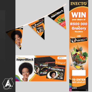
General point of sale work done throughout the last few years

Inecto Colours is one of Inecto’s biggest brands next to Inecto SuperBlack. Similar to SuperBlack it has a strong heritage and loyal consumers. The decision was taken that it was time to refresh the Inecto Colours packaging to make it more relevant for today’s consumer and to use more realistic and true to the brand target market models.


Work done over the course of the last few years for varies brands and organisations
