

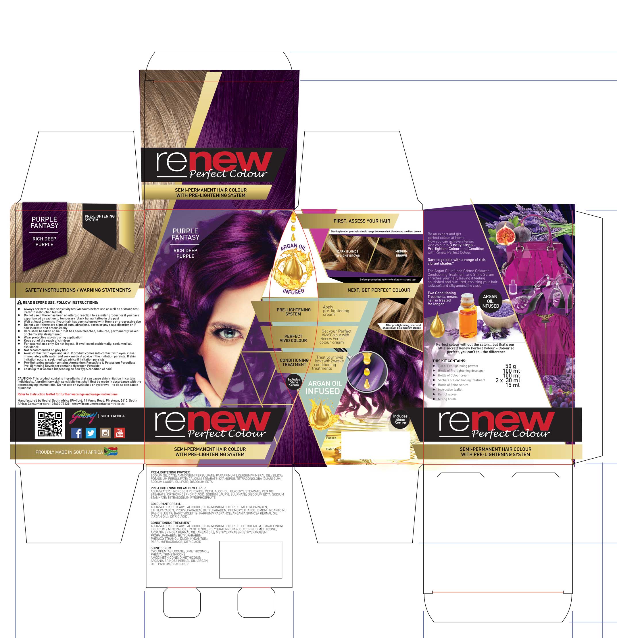
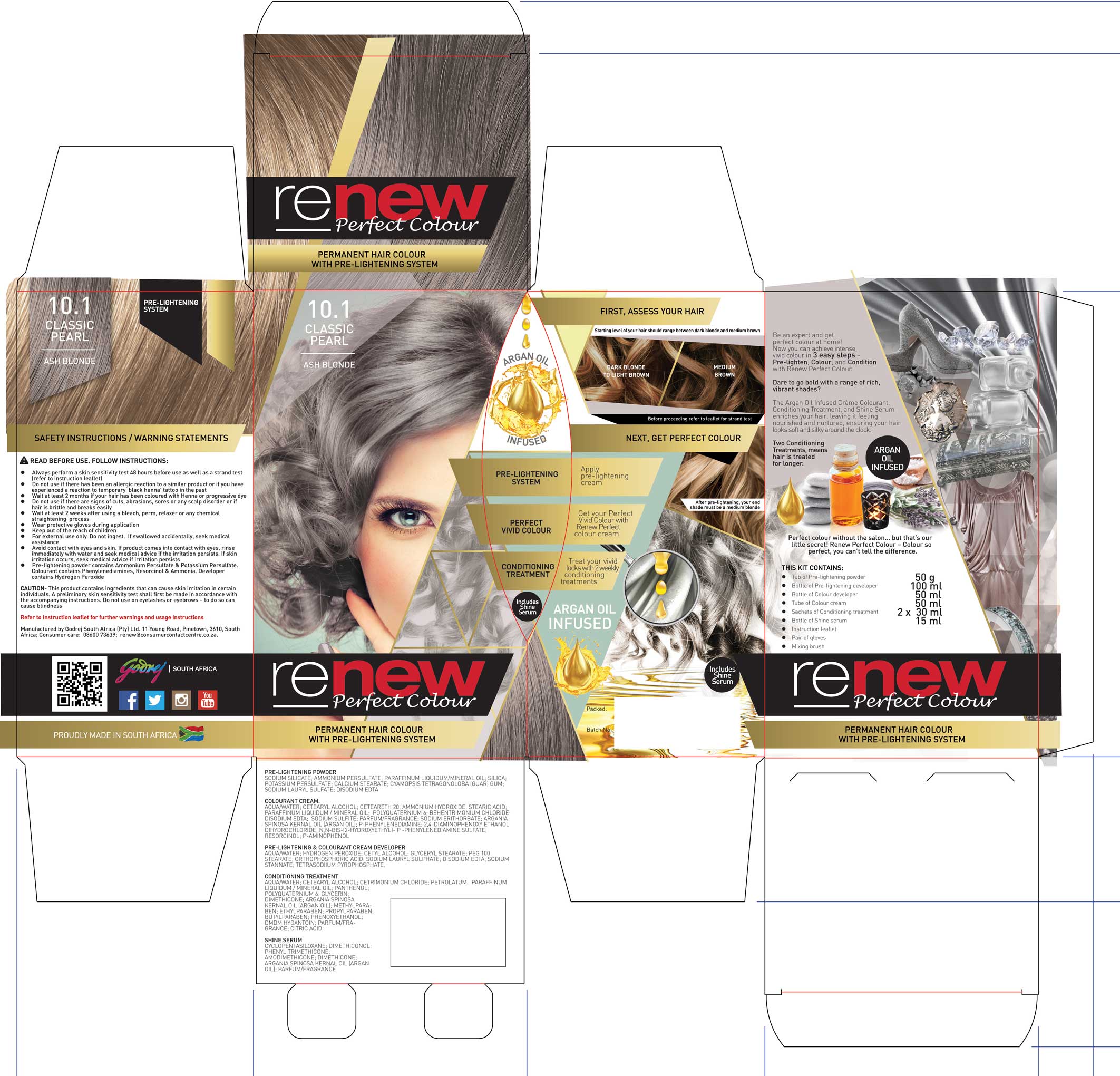
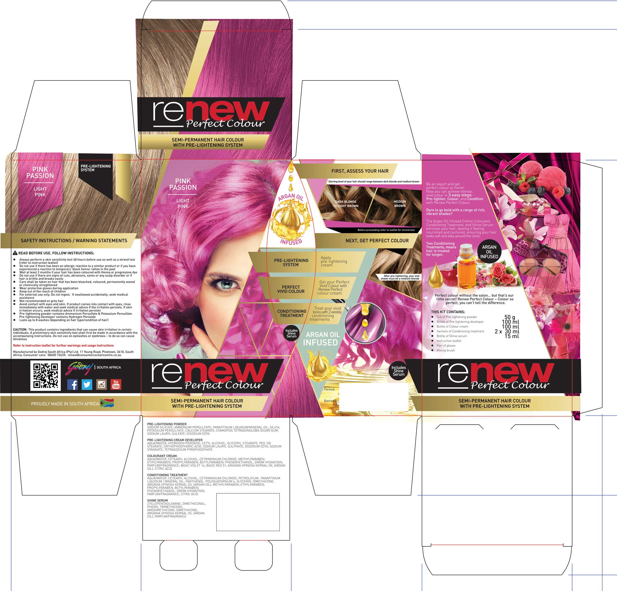
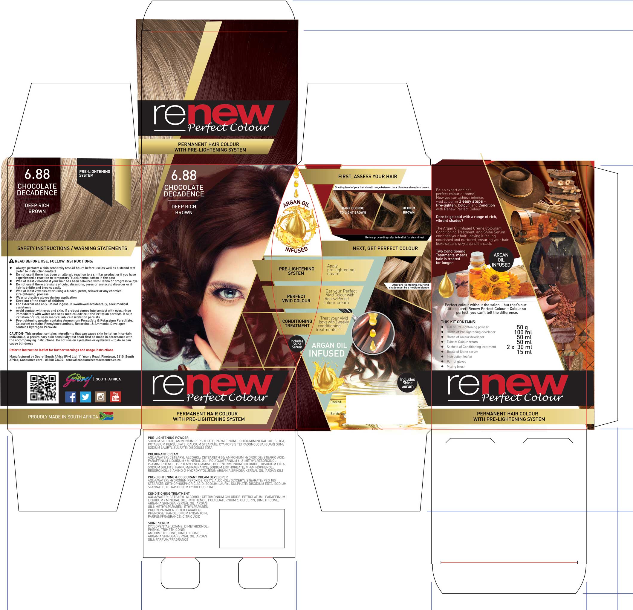






Packaging Refresh & Brand Evolution
Category: FMCG | Haircare
Scope: Product Concept Development, Structural Packaging Design, Brand Launch, SKU Rollout, Model Direction, Technical Colour Matching
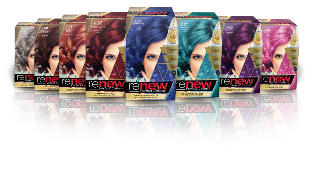
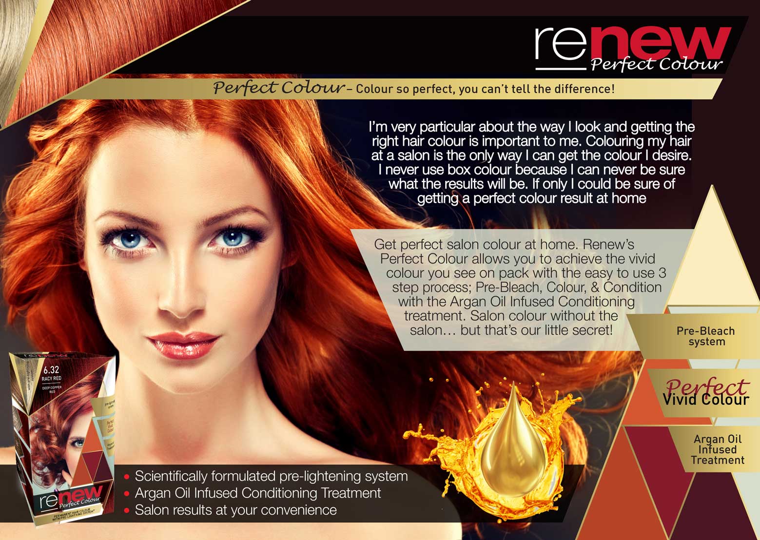
Renew Perfect Colour was a bold, new-to-market hair colour range designed to introduce vibrant, fashion-forward shades to the South African FMCG space. Combining a pre-lightening system with high-impact colour payoff, the product repositioned the Renew brand as innovative, expressive, and category-disruptive.

Renew Perfect Colour was developed as a bold, high-impact addition to the Renew portfolio — introducing a pre-lightening system designed to unlock vibrant, fashion-forward shades at home. At a time when unconventional colours were still emerging in the South African market, this range positioned Renew as progressive, confident, and performance-led.
(*Delivered in a senior internal brand and design capacity)
Launching a Bold Innovation into a Conservative Category
The South African hair colour market was dominated by traditional tones and conventional packaging systems.
Renew Perfect Colour aimed to:
Introduce vivid, fashion-forward shades
Educate consumers on a two-step pre-lightening + colouring process
Simplify what could feel technically intimidating
Establish Renew as a performance leader
Stand out in an already visually competitive category
The complexity wasn’t just visual — it was behavioural. Consumers had to trust a process they weren’t yet familiar with.
The strategy centred on disruption with discipline — making bold colour the hero while simplifying a technically complex two-step process. The design needed to feel fearless and fashion-forward, yet structured enough to build consumer trust and ensure clarity at shelf.
This wasn’t just packaging design — it was product storytelling.
The strategic pillars were:
Make colour the hero
One model across all SKUs to emphasise transformation.
Own boldness confidently
Use high-impact, fashion-inspired mood direction.
Simplify complexity visually
Clear, structured hierarchy to guide consumers through the pre-lighten + colour system.
Ensure credibility
Precise colour matching between formulation, swatches, model hair, and pack visuals.
Create flagship presence
Position the range as a statement product within the broader Renew portfolio.
The design had to feel fearless — but never confusing.
I led the design from concept to full market launch, including:
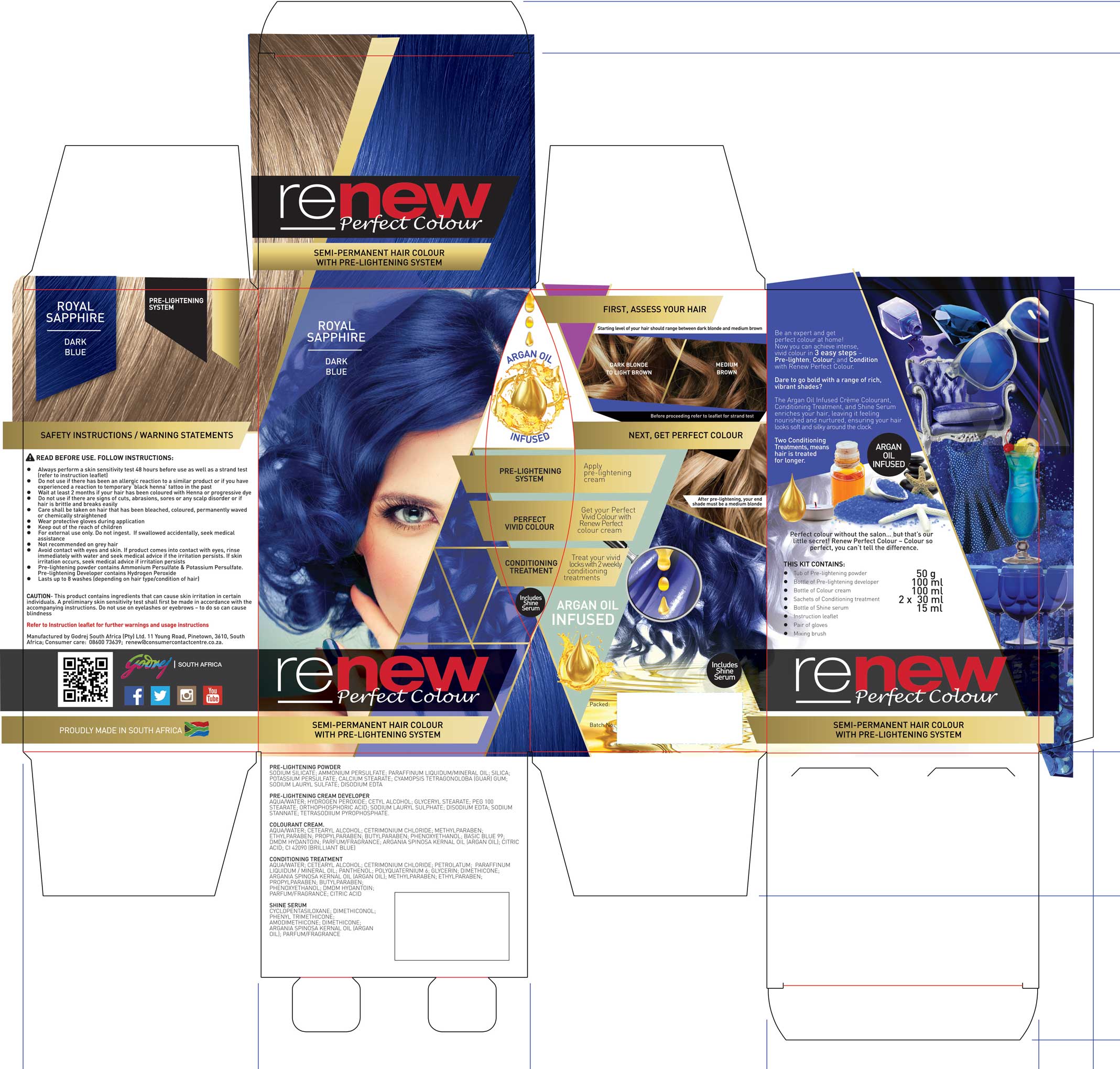
Structural packaging concept (triangular lid design concept development)
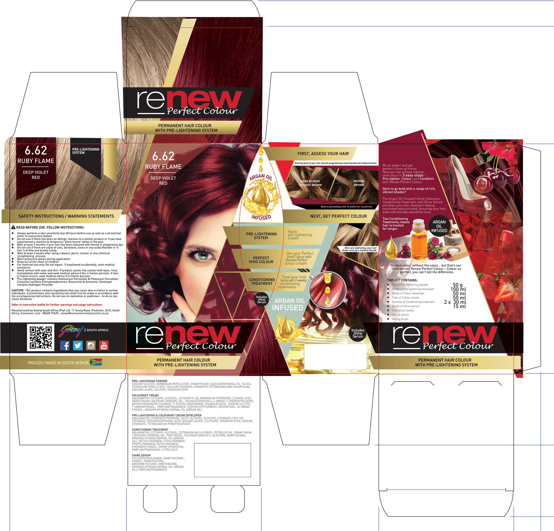
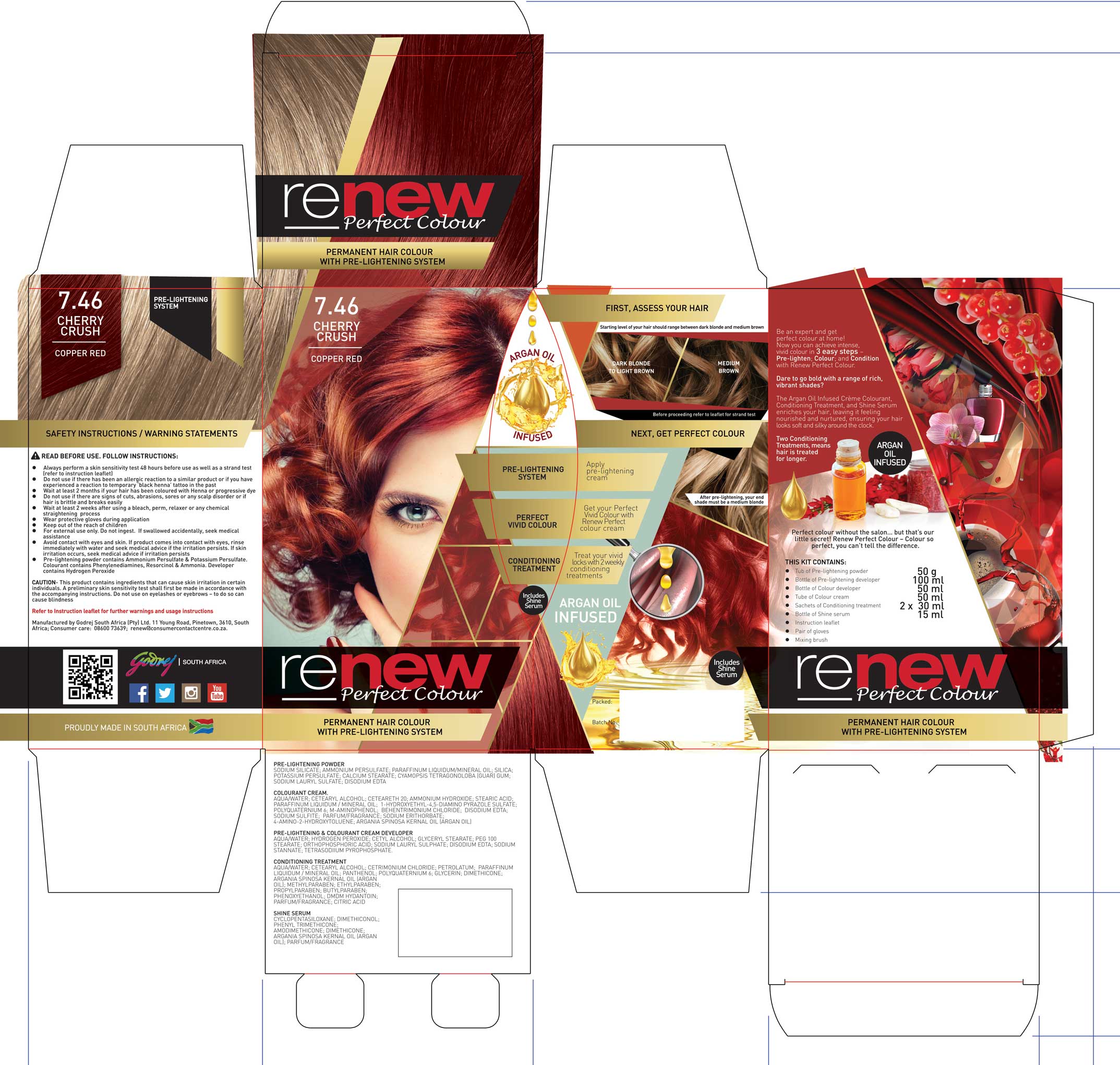
Full packaging system across 8 SKUs
Colour correction and retouching of a single hero model per shade
Technical colour matching with Product Development & Integrity
Swatch accuracy validation
Instruction leaflet design from scratch
Inner element labels and component artwork
Mood boards and concept direction
Marketing alignment and rollout assets
Trade presenter materials
Supporting campaign visuals and digital templates
The goal: make the colour believable, aspirational, and achievable.
Designing Renew Perfect Colour required balancing creative expression with technical precision. The structural pack concept, colour system, model retouching, and on-pack communication were all engineered to ensure that what consumers saw on shelf accurately reflected the result in-box. From colour correction and swatch alignment to simplifying a multi-step process into intuitive visual cues, every element was built to reduce uncertainty while amplifying impact.
We selected one stock model across the range to:
Strengthen brand recognition
Reduce visual clutter
Make the hair colour transformation the focal point
Improve SKU differentiation through tone variation alone
Working directly with Product Development:
Hair was colour corrected to match physical swatches
Swatches were calibrated against actual formulation output
Pack visuals reflected realistic achievable results
In a category where trust is everything, colour accuracy was non-negotiable.
Pre-lightening + colouring introduces cognitive load.
The packaging design:
Structured the steps clearly
Marked key usage parameters
Highlighted limitations (e.g. not suitable for dark hair without correct lightening level)
Reduced overwhelm through visual sequencing
Bold doesn’t mean chaotic.
Disruptive doesn’t mean unclear.
This project extended far beyond visual design. It required technical coordination, structural problem-solving, and cross-functional collaboration to bring a complex product to market.
Scope included:
Structural packaging concept development (triangular lid and side-close system)
Full outer pack artwork across 8 SKUs
Colour correction and swatch calibration to ensure true-to-pack accuracy
Instruction leaflet design and technical content layout
Inner element labels and compliance information
Trade presenter and retail display collateral
Research-backed refinement prior to rollout
Production-ready artwork and print oversight
Every element had to balance bold visual disruption with clarity, compliance, and manufacturability.
Outcome: A launch-ready system that translated concept into shelf-ready execution — consistently, accurately, and at scale.
The launch contributed to:
Renew achieving #1 market position in value and volume share
Elevated brand perception
Strong retail presence
Establishing Renew as a performance-driven, fashion-conscious leader
For the team — and for me — this was a defining brand moment.
Product Launch Strategy | Structural Packaging Design | SKU System Architecture | FMCG Brand Development | Visual Hierarchy & Consumer Guidance | Technical Colour Matching | Campaign & Trade Rollout | Cross-Functional Product Alignment