OUR WORK / Consumer brands
Inecto Unlimited
Category Disruption & Behaviour-Shift Innovation
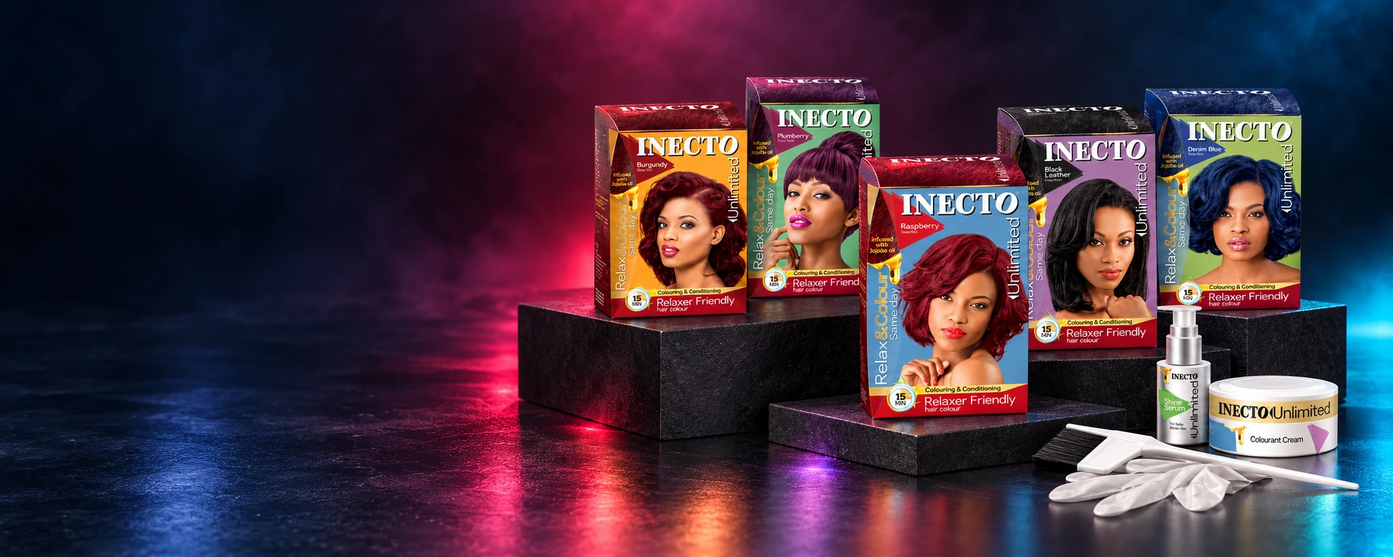
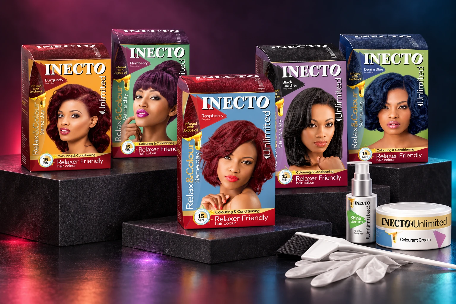
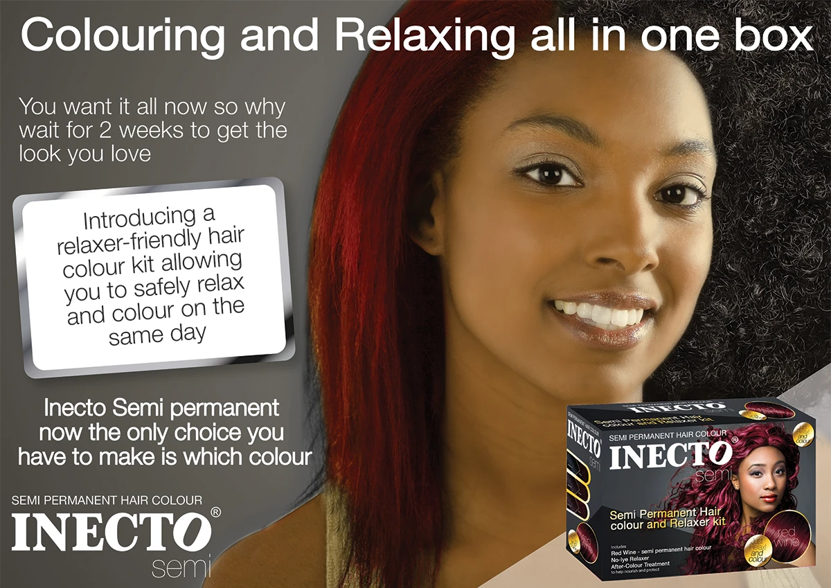
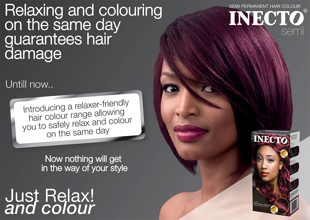
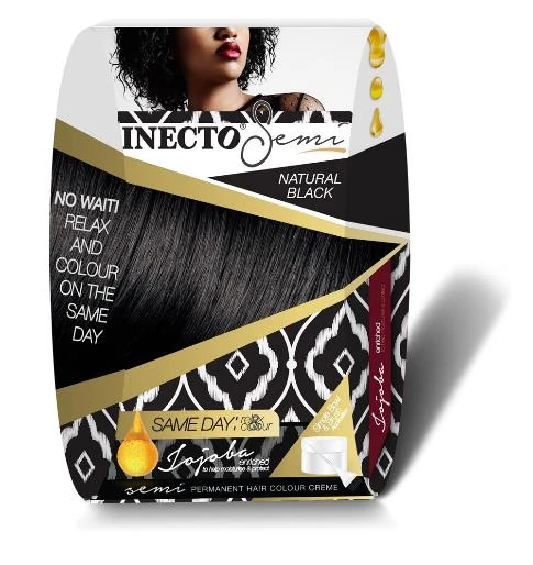
Inecto Unlimited is a semi-permanent hair colour specifically formulated to allow consumers to relax and colour their hair on the same day, removing the traditional waiting period required to avoid over-processing.
- Client / organisation
- Inecto / Godrej
- Connected capabilities
- Product identity · Packaging · Art direction
- Project context
- Product range launch
Our involvement Delivered by Lynette Lombaard in a senior internal brand and design capacity.
The original case study describes it as a first-of-its-kind innovation in the South African market, positioned as a bold, fashion-forward solution for expressive, younger consumers.
THE CONTEXT
Make a new colour ritual feel intuitive.
Inecto Unlimited was developed to remove a long-standing barrier in the category: the waiting period between relaxing and colouring hair.
Designed for a bold, younger audience, the range needed to communicate innovation, safety, and fashion-forward confidence, all while clearly explaining a new usage behaviour.
THE STRATEGIC CHALLENGE
The challenge
The challenge was twofold.
The pack had to communicate innovation and safety simultaneously. It needed to feel bold and expressive, yet technically credible. Too much disruption risked undermining trust. Too much caution would dilute the impact of the innovation.
- Introduce a new behaviour into the market, same-day relax and colour, without confusing or overwhelming the consumer.
- Visually differentiate the range within a competitive hair colour category while maintaining alignment with the trusted Inecto masterbrand.
THE STORY / 01
Strategic approach
Launching Inecto Unlimited required more than visual differentiation; it required introducing a new consumer behaviour into an established category.
The strategy focused on balancing technical reassurance with bold visual energy, ensuring innovation felt both credible and desirable.
The strategy centred on clarity, confidence, and visual energy.
The system needed to educate, excite, and reassure, all within seconds at shelf.
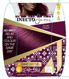
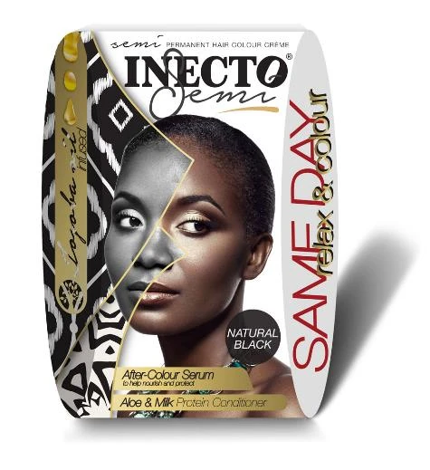
- Clear communication of the “Same Day” benefit
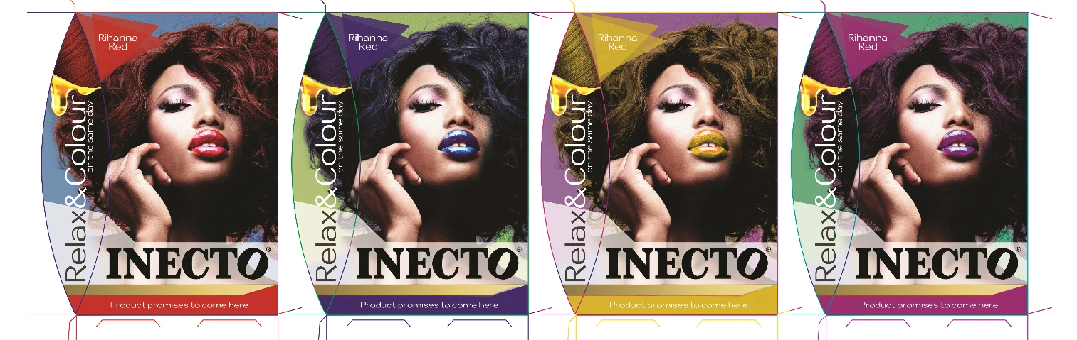
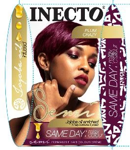
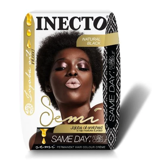
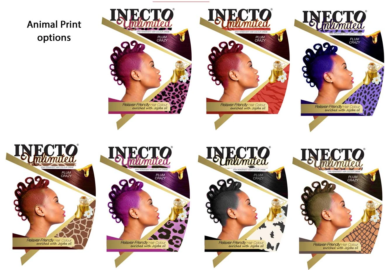
- Strong colour differentiation per SKU
- Aspirational, fashion-forward visual language
- Simplifying a technically complex offering into intuitive visual cues
THE STORY / 02
Design intelligence
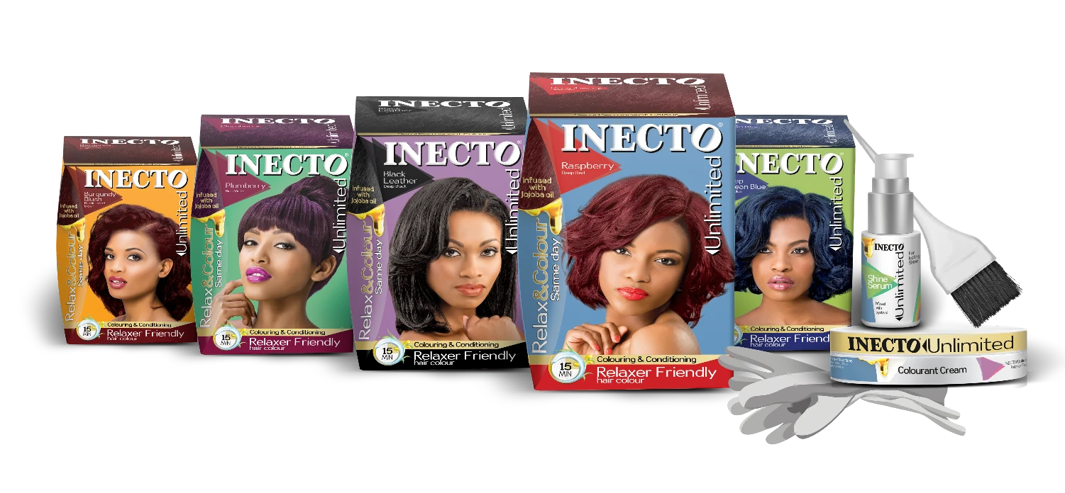
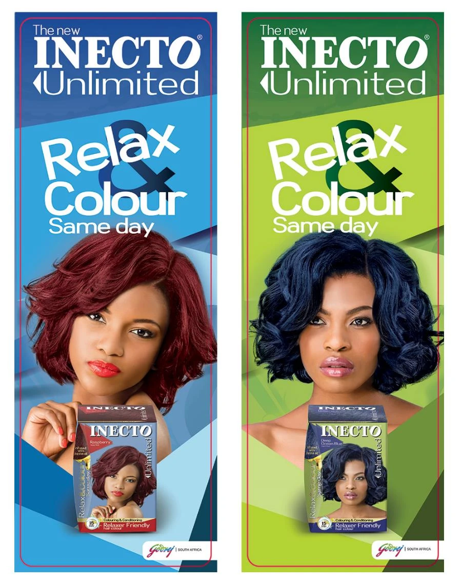
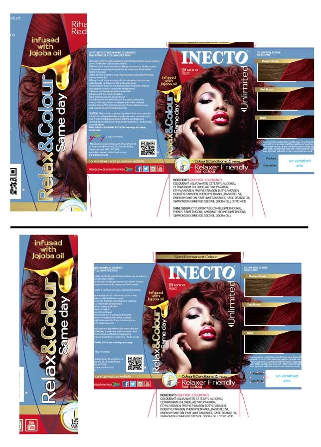
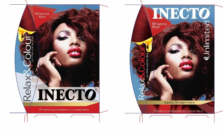
The visual identity was built around bold colour blocking, geometric layering, and high-impact model imagery to reflect transformation and movement.
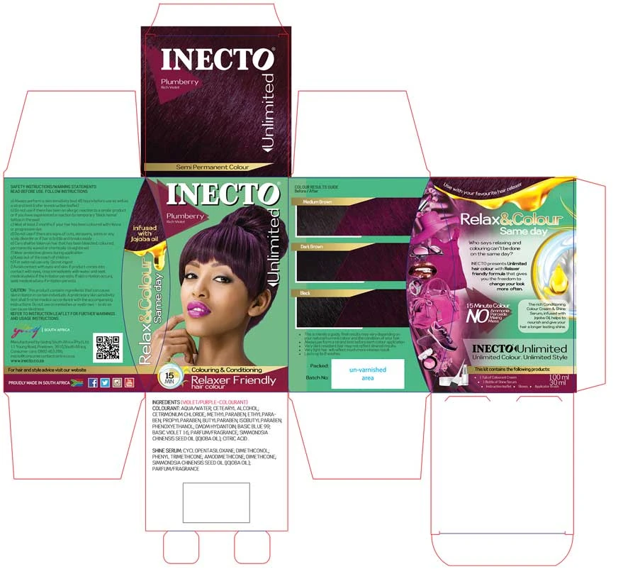
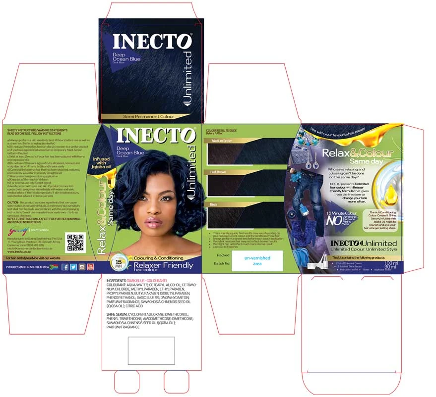
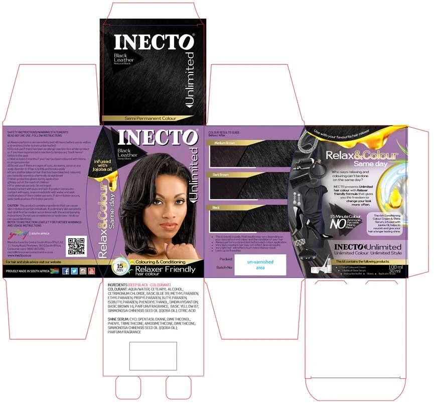
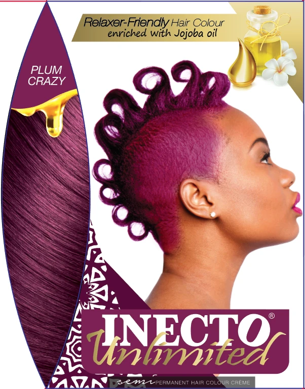
Each SKU carried a dominant colour personality while retaining masterbrand consistency. Model selection, retouching, and hair colour correction were carefully managed to ensure visual vibrancy matched physical swatches, a critical factor in a high-trust category.
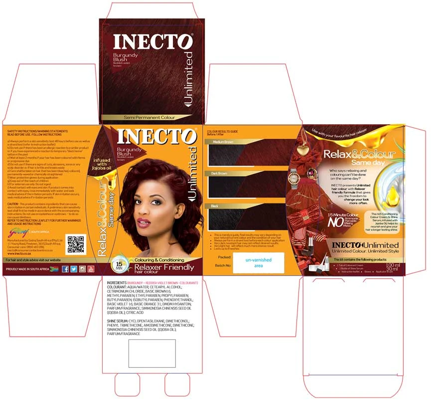
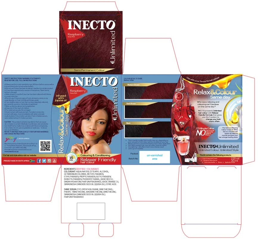
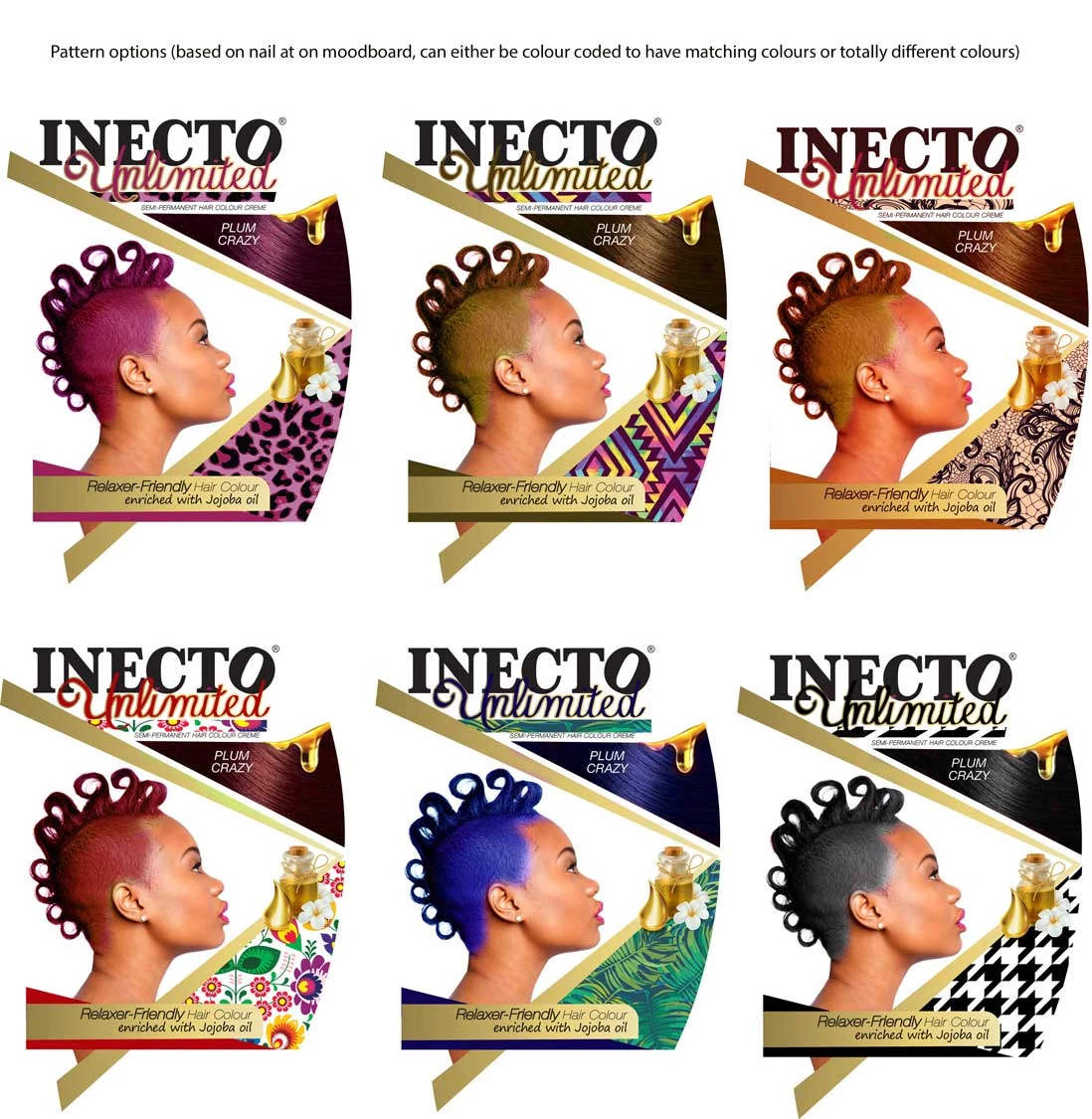
The back-of-pack introduced mood-board-inspired lifestyle cues to reinforce the aspirational positioning of the range.
FROM STRATEGY TO EXECUTION
Execution detail
Execution extended beyond packaging aesthetics.
Every touchpoint, from outer pack and internal components to supporting materials, was aligned into one cohesive launch system.
- Structural pack development and layout engineering
- Concept development across multiple design routes
- Photoshoot coordination and model selection
- High-precision hair colour retouching and correction
- Close collaboration with Product Development to ensure shade accuracy
- Creation of instruction leaflets and all inner element labels
- Full rollout across 5 SKUs
WHAT THE WORK ENABLED
Impact
The original case study describes Inecto Unlimited as a category-first innovation that challenged the traditional wait-period model associated with relaxer and colour treatments.
Beyond packaging, the project demonstrated how strategic design can shift behaviour, build trust, and drive brand progression within a legacy portfolio.
- Introduced a new usage ritual into the market
- Strengthened Inecto’s perception as an innovation-led brand
- Expanded appeal to a younger, more fashion-forward demographic
- Delivered strong shelf differentiation in a crowded category
SKUs in the launch system
A coordinated five-shade packaging and launch rollout.
A new relax-and-colour ritual
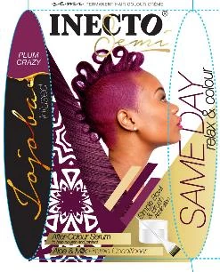
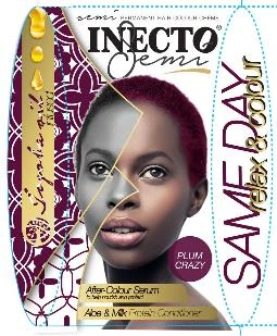
Packaging and consumer instructions explained the range’s same-day relax-and-colour benefit.
Shade accuracy and art direction
Photoshoot direction, hair-colour retouching and swatch alignment connected the range’s visual system.

FROM OUR PARTNERS
THE PROJECT, IN DETAIL
The work behind
the story.
Browse the original project artwork and interfaces using the thumbnails below. Select View full screen for a closer look, then Close image to return.
 View full screen
 View full screen
 View full screen
 View full screen
 View full screen
 View full screen
 View full screen
 View full screen
 View full screen
 View full screen
 View full screen
 View full screen
 View full screen
 View full screen
 View full screen
 View full screen
 View full screen
 View full screen
 View full screen
 View full screen
 View full screen
 View full screen